![]()

 |
|
 |

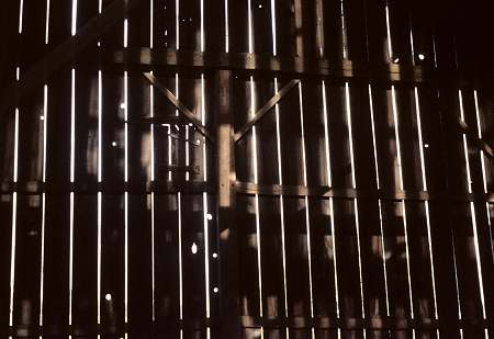
This is another scanned slide. I took the photo back in 1965. It was taken from inside a barn. I thought the vertical lines in the barn siding with the vertical sunlight lines made for an interesting pattern.
What do you think?
Posted by Ted at February 7, 2005 8:47 PMVery nice. Try using a sepia tone and see how that also looks. Sepia works well on buildings.
Posted by: reborrell at February 13, 2005 7:14 PM